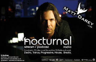
Although this isn't an advert for a new and upcoming band, this is an advertisement for a radio station which is therefore still relevant to my project as it is promoting the station. Here, the close up shot of the radio presenter is promoting his image, yet this is ironic because you only hear the voices of the presenters and there identity is never revealed.
However, the white typography of the title contrasts against the dark mise en scene, which makes the title of the station stand out to an audience as there flicking through pages of a magazine. Furthermore, underneath the title the details of the radio station is written below, which promotes the genre of music which is broad casted and the company of the station. This is the point and objective of magazine advertisements; to promote aspects of the music industry. Moreover, in the corner of the advert they have a website which is eye catching because of the way its presented next to the symbol of a white bird, which will catch an audiences eye and encourage them to log onto their website to learn more about them. Moreover, the mise en scene looks effective with the background of a city scape behind the man is blurred out, which connotes nightlife and excitement amongst city life.
Overall, this type of advert would stand out in a magazine as it effectively promotes the radio station and type of genre of music is played through the effective mise en scene and white typography which contrasts against the dark background of city life.
No comments:
Post a Comment