This is the front cover of my
digipak, and I like it because it is representative of both the genre of our band, yet also the recurring theme of love in our music video. For example, the colour red is throughout the
digipak which connotes love, heart break and destructive. Yet also, the colour stands out amongst other rivals which an audience will notice as their walking past. Moreover, a particular aspect which I like is the chalk style typography on the door hanging of "
Nobody's Home." This is because of the kisses at the end, which again is suggestive of a love story, yet also represents the theme of the music video. For example, the symbol of the door matches with song title "home," making the front of my
digipak relevant. Furthermore, a mid shot of Tamas and his head angled towards the audience allows his identity to be recognised easily by his fan base, which helps promote the CD. Also, an important factor is that the red door relates significantly to the female protagonist red coat, which she wears
throughout the video to connote passion and love. Therefore, it seemed
appropriate to have the
continuous theme of red to lead onto the graphics of the
digipak.

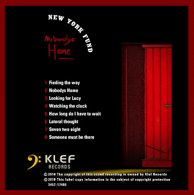
This is the back of my
digipak. I have kept the recurring theme of the door and colour red so the entire CD looks effective, as the symbol of the door relates to the genre. I have chosen to feature the names of each song on the back, as this is a common feature on many CD covers such as Florence And The Machine and Kings Of Leon. Moreover, I decided to feature the record label and advertise it on the back as this will promote the record label itself as an audience will be able to
identify the bands producers. Furthermore, I even decided to
photoshop in the copyright labels, as this adds to the realism of the
digipak cover. I also like the
typgraphy of "
Nobody's Home" as the type font matches the sinister atmosphere as it doesn't stand out in terms of size, yet the font resembles a persons hand writing; which creates a personal touch. The effect of lighting contrasts strongly against the black
mise en scene, which enables the red to be more
emphasised, with the black suggestive of Tamas and his dark state of mind as his home is empty.
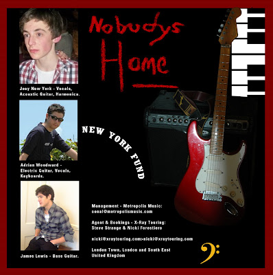
This side is going to feature inside the
digipak. Here I have
promoted the members of the band, the role they play, their manager and more musical elements such as the guitar and
keyboard. The reason for featuring instruments is that it is suggestive of the genre Indie, as these are the type of instruments which are played in the band "The New York Fund." Moreover, the result of promoting the band members is so their audience will become familiar with there identity and relate to them more. This is particularly important to do in this album because I am promoting a new and
upcoming band. As a result, they wont have many fans yet, so by building them an identity on the
digipak allows them to almost connect with the audience, and promotes their image. The audience will consequently become familiar with the roles they play and what they contribute to in the band.
This is the final
digipak side which will again feature inside the
digipak. I chose to have the guitar used as the
mise en scene because the guitar is an important instrument which is played in the band, and makes my
digipak relevant to the genre. Furthermore, it was
important to feature Tamas again on the
digipak because it promotes his
identity fully, allowing him to build a growing fan base. Again I have used the recurring typography so New York Fund will develop a strong label which can be repeated on their future albums they release.
 This is the back of my digipak. I have kept the recurring theme of the door and colour red so the entire CD looks effective, as the symbol of the door relates to the genre. I have chosen to feature the names of each song on the back, as this is a common feature on many CD covers such as Florence And The Machine and Kings Of Leon. Moreover, I decided to feature the record label and advertise it on the back as this will promote the record label itself as an audience will be able to identify the bands producers. Furthermore, I even decided to photoshop in the copyright labels, as this adds to the realism of the digipak cover. I also like the typgraphy of "Nobody's Home" as the type font matches the sinister atmosphere as it doesn't stand out in terms of size, yet the font resembles a persons hand writing; which creates a personal touch. The effect of lighting contrasts strongly against the black mise en scene, which enables the red to be more emphasised, with the black suggestive of Tamas and his dark state of mind as his home is empty.
 This side is going to feature inside the digipak. Here I have promoted the members of the band, the role they play, their manager and more musical elements such as the guitar and keyboard. The reason for featuring instruments is that it is suggestive of the genre Indie, as these are the type of instruments which are played in the band "The New York Fund." Moreover, the result of promoting the band members is so their audience will become familiar with there identity and relate to them more. This is particularly important to do in this album because I am promoting a new and upcoming band. As a result, they wont have many fans yet, so by building them an identity on the digipak allows them to almost connect with the audience, and promotes their image. The audience will consequently become familiar with the roles they play and what they contribute to in the band.
 This is the final digipak side which will again feature inside the digipak. I chose to have the guitar used as the mise en scene because the guitar is an important instrument which is played in the band, and makes my digipak relevant to the genre. Furthermore, it was important to feature Tamas again on the digipak because it promotes his identity fully, allowing him to build a growing fan base. Again I have used the recurring typography so New York Fund will develop a strong label which can be repeated on their future albums they release.
I like the image with a close up of Tamas. You need to explain how the red door is generic. You need to comment that a link between the music video and the graphics on the digipak is the muse's red coat in the video.
ReplyDeleteEvidence of commitment is strong.
I mean the RED door in the digipak panel references the girl's red coat in the music video.
ReplyDeleteAfter another quick look through your design ideas I think the final idea with close up of Tamas should be the front cover. It has the wow factor.
Excellently evaluated planning here. Well done Lucy. Also an improvement in your use of media terminology.
ReplyDelete