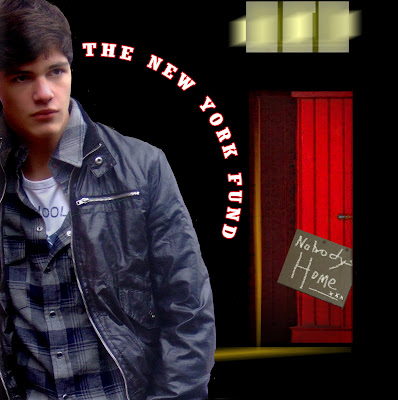
This front cover is stronger than the original because the red door stands out more as it contrasts against the black
mise en scene. Furthermore, I decided on using this photo of Tamas opposed to the one of him crouching because this looks more professional; with the crouching pose looking out of place and not really fitting in with the rest of the cover. However, with Tamas standing like this his posture is striking as it takes up a majority of the front cover. His facial expression also looks lost conveying the theme of our song "
Nobodys Home",
alongside the red door connoting love and passion which is suggestive of our female
protagonist red coat. I also decided to coat a red outline
alongside the lettering of "The New York Fund" to continue the running theme of red, yet decided to not use the red boarders as it looked too much. Furthermore, I decided to not have the building in detail as the
mise en scene, because the plain black makes the feature of the red door and Tamas stand out more strongly.
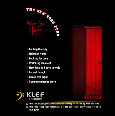
This face hasn't changed since the last one, apart from again getting rid of the red border to make each face look similar and have a continual theme. The red door here again stands out and connotes
loneliness, and to increase the realism I have decided to add "
KLEF records" and the yellow symbol which is a connotation of the record label. As a result, this promotes the record label on our
digipak, allowing audiences to see where the new band came from. I have decided to add a red coat to the band title so the
digipak looks neat and each face looks like they all belong together to make a
digipak. Again, I have used the name of each song to feature on the back cover, as this is a running theme throughout a lot of
digipak as it promotes the New York Funds song collection.
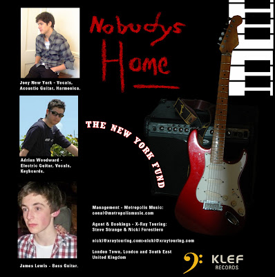
This hasn't changed that much since the original face, apart from a few key features. The main one being that I added the effect of the keyboards to add a musical theme, which is suggestive of the genre of the band "Indie," as a guitar and key board and the instruments which are played. Again I have added the symbol of "
KLEF records" on each face as its a method of good promotion. Moreover, I have swapped the photos of Ben
Dilks and Tamas round so Tamas is the lead vocalist, which is a mistake which I made in the original face!
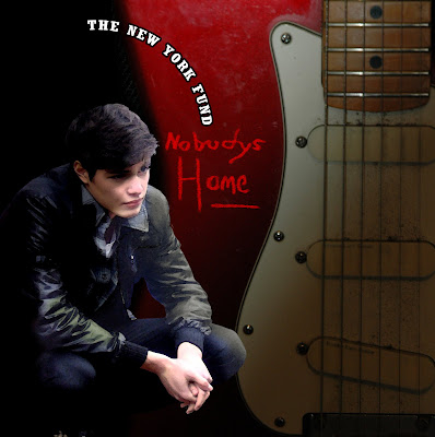
With this face, which is going to feature in the inside of the
digipak, the only feature which I have changed is the photo of Tamas. Instead, I swapped the standing Tamas with him crouching; the pose I originally used on the front cover. I think the crouching Tamas looks better here because it
makes the guitar look
dominating which again is suggestive of the band genre. Tamas also looks lost here with his hands clasped together suggestive of his
loneliness and love for our female protagonist.
 This front cover is stronger than the original because the red door stands out more as it contrasts against the black mise en scene. Furthermore, I decided on using this photo of Tamas opposed to the one of him crouching because this looks more professional; with the crouching pose looking out of place and not really fitting in with the rest of the cover. However, with Tamas standing like this his posture is striking as it takes up a majority of the front cover. His facial expression also looks lost conveying the theme of our song "Nobodys Home", alongside the red door connoting love and passion which is suggestive of our female protagonist red coat. I also decided to coat a red outline alongside the lettering of "The New York Fund" to continue the running theme of red, yet decided to not use the red boarders as it looked too much. Furthermore, I decided to not have the building in detail as the mise en scene, because the plain black makes the feature of the red door and Tamas stand out more strongly.
 This face hasn't changed since the last one, apart from again getting rid of the red border to make each face look similar and have a continual theme. The red door here again stands out and connotes loneliness, and to increase the realism I have decided to add "KLEF records" and the yellow symbol which is a connotation of the record label. As a result, this promotes the record label on our digipak, allowing audiences to see where the new band came from. I have decided to add a red coat to the band title so the digipak looks neat and each face looks like they all belong together to make a digipak. Again, I have used the name of each song to feature on the back cover, as this is a running theme throughout a lot of digipak as it promotes the New York Funds song collection.
 This hasn't changed that much since the original face, apart from a few key features. The main one being that I added the effect of the keyboards to add a musical theme, which is suggestive of the genre of the band "Indie," as a guitar and key board and the instruments which are played. Again I have added the symbol of "KLEF records" on each face as its a method of good promotion. Moreover, I have swapped the photos of Ben Dilks and Tamas round so Tamas is the lead vocalist, which is a mistake which I made in the original face!
 With this face, which is going to feature in the inside of the digipak, the only feature which I have changed is the photo of Tamas. Instead, I swapped the standing Tamas with him crouching; the pose I originally used on the front cover. I think the crouching Tamas looks better here because it makes the guitar look dominating which again is suggestive of the band genre. Tamas also looks lost here with his hands clasped together suggestive of his loneliness and love for our female protagonist.
Effective digipak ideas, could you print out all 4 panels review & magazine cover before finalising ideas abd submit to me by tomorrow.
ReplyDeleteMs B
Thanks for revising the apostrophe problem in your print productions. If you didn't replace them then we can sort this out tomorrow.
ReplyDeleteYou print productions have a wonderful finish and depth. Well done Lucy.