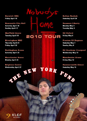
 This is my final version of my magazine advert. I decided to use the pose of Tamas sleeping on the couch because it connotes the idea of him being tired from being on the tour Furthermore, in the bottom corner I have used the "KLEF records" again with the yellow symbol to promote the record label, since the idea of a magazine advert is centred around promoting the artist alongside the record company. The symbol of the guitar is also included, as it is suggestive of the genre as obviously on stage the artist will be playing guitars live to their fans. Similarly to the digipak, I have used the symbol of the red door because it connotes love and links in with their album; something which an audience will recognise. The door also looks effective against the black mise en scene as it contrasts against the colour; another feature which I used on my digipak. Also, with my magazine advert I decided to promote their tour, and I have achieved this by typing in each destination they are playing at and the dates so their audience will know. This is also a common feature in magazine adverts; with the aim of them to promote when they are playing so this increases the tick sales.
Sunday, 31 January 2010
My Magazine Advert
Magazine advert featured in NME magazine, because this magazine promotes bands of the same genre as "The New York Fund." The following genres include; Indie, Rock, Pop Rock, Folk Rock etc. NME is also a well known music magazine, therefore it would make sense for my magazine advert to appear in here.
 This is my final version of my magazine advert. I decided to use the pose of Tamas sleeping on the couch because it connotes the idea of him being tired from being on the tour Furthermore, in the bottom corner I have used the "KLEF records" again with the yellow symbol to promote the record label, since the idea of a magazine advert is centred around promoting the artist alongside the record company. The symbol of the guitar is also included, as it is suggestive of the genre as obviously on stage the artist will be playing guitars live to their fans. Similarly to the digipak, I have used the symbol of the red door because it connotes love and links in with their album; something which an audience will recognise. The door also looks effective against the black mise en scene as it contrasts against the colour; another feature which I used on my digipak. Also, with my magazine advert I decided to promote their tour, and I have achieved this by typing in each destination they are playing at and the dates so their audience will know. This is also a common feature in magazine adverts; with the aim of them to promote when they are playing so this increases the tick sales.
This is my final version of my magazine advert. I decided to use the pose of Tamas sleeping on the couch because it connotes the idea of him being tired from being on the tour Furthermore, in the bottom corner I have used the "KLEF records" again with the yellow symbol to promote the record label, since the idea of a magazine advert is centred around promoting the artist alongside the record company. The symbol of the guitar is also included, as it is suggestive of the genre as obviously on stage the artist will be playing guitars live to their fans. Similarly to the digipak, I have used the symbol of the red door because it connotes love and links in with their album; something which an audience will recognise. The door also looks effective against the black mise en scene as it contrasts against the colour; another feature which I used on my digipak. Also, with my magazine advert I decided to promote their tour, and I have achieved this by typing in each destination they are playing at and the dates so their audience will know. This is also a common feature in magazine adverts; with the aim of them to promote when they are playing so this increases the tick sales.
Digipak Cover - Final Version
 This front cover is stronger than the original because the red door stands out more as it contrasts against the black mise en scene. Furthermore, I decided on using this photo of Tamas opposed to the one of him crouching because this looks more professional; with the crouching pose looking out of place and not really fitting in with the rest of the cover. However, with Tamas standing like this his posture is striking as it takes up a majority of the front cover. His facial expression also looks lost conveying the theme of our song "Nobodys Home", alongside the red door connoting love and passion which is suggestive of our female protagonist red coat. I also decided to coat a red outline alongside the lettering of "The New York Fund" to continue the running theme of red, yet decided to not use the red boarders as it looked too much. Furthermore, I decided to not have the building in detail as the mise en scene, because the plain black makes the feature of the red door and Tamas stand out more strongly.
 This face hasn't changed since the last one, apart from again getting rid of the red border to make each face look similar and have a continual theme. The red door here again stands out and connotes loneliness, and to increase the realism I have decided to add "KLEF records" and the yellow symbol which is a connotation of the record label. As a result, this promotes the record label on our digipak, allowing audiences to see where the new band came from. I have decided to add a red coat to the band title so the digipak looks neat and each face looks like they all belong together to make a digipak. Again, I have used the name of each song to feature on the back cover, as this is a running theme throughout a lot of digipak as it promotes the New York Funds song collection.
 This hasn't changed that much since the original face, apart from a few key features. The main one being that I added the effect of the keyboards to add a musical theme, which is suggestive of the genre of the band "Indie," as a guitar and key board and the instruments which are played. Again I have added the symbol of "KLEF records" on each face as its a method of good promotion. Moreover, I have swapped the photos of Ben Dilks and Tamas round so Tamas is the lead vocalist, which is a mistake which I made in the original face!
 With this face, which is going to feature in the inside of the digipak, the only feature which I have changed is the photo of Tamas. Instead, I swapped the standing Tamas with him crouching; the pose I originally used on the front cover. I think the crouching Tamas looks better here because it makes the guitar look dominating which again is suggestive of the band genre. Tamas also looks lost here with his hands clasped together suggestive of his loneliness and love for our female protagonist.
 Wednesday, 27 January 2010
Final Digipak!
This is the front cover of my digipak, and I like it because it is representative of both the genre of our band, yet also the recurring theme of love in our music video. For example, the colour red is throughout the digipak which connotes love, heart break and destructive. Yet also, the colour stands out amongst other rivals which an audience will notice as their walking past. Moreover, a particular aspect which I like is the chalk style typography on the door hanging of "Nobody's Home." This is because of the kisses at the end, which again is suggestive of a love story, yet also represents the theme of the music video. For example, the symbol of the door matches with song title "home," making the front of my digipak relevant. Furthermore, a mid shot of Tamas and his head angled towards the audience allows his identity to be recognised easily by his fan base, which helps promote the CD. Also, an important factor is that the red door relates significantly to the female protagonist red coat, which she wears throughout the video to connote passion and love. Therefore, it seemed appropriate to have the continuous theme of red to lead onto the graphics of the digipak.
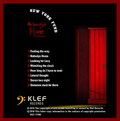
 This is the back of my digipak. I have kept the recurring theme of the door and colour red so the entire CD looks effective, as the symbol of the door relates to the genre. I have chosen to feature the names of each song on the back, as this is a common feature on many CD covers such as Florence And The Machine and Kings Of Leon. Moreover, I decided to feature the record label and advertise it on the back as this will promote the record label itself as an audience will be able to identify the bands producers. Furthermore, I even decided to photoshop in the copyright labels, as this adds to the realism of the digipak cover. I also like the typgraphy of "Nobody's Home" as the type font matches the sinister atmosphere as it doesn't stand out in terms of size, yet the font resembles a persons hand writing; which creates a personal touch. The effect of lighting contrasts strongly against the black mise en scene, which enables the red to be more emphasised, with the black suggestive of Tamas and his dark state of mind as his home is empty.
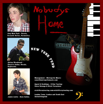
 This side is going to feature inside the digipak. Here I have promoted the members of the band, the role they play, their manager and more musical elements such as the guitar and keyboard. The reason for featuring instruments is that it is suggestive of the genre Indie, as these are the type of instruments which are played in the band "The New York Fund." Moreover, the result of promoting the band members is so their audience will become familiar with there identity and relate to them more. This is particularly important to do in this album because I am promoting a new and upcoming band. As a result, they wont have many fans yet, so by building them an identity on the digipak allows them to almost connect with the audience, and promotes their image. The audience will consequently become familiar with the roles they play and what they contribute to in the band.
 This is the final digipak side which will again feature inside the digipak. I chose to have the guitar used as the mise en scene because the guitar is an important instrument which is played in the band, and makes my digipak relevant to the genre. Furthermore, it was important to feature Tamas again on the digipak because it promotes his identity fully, allowing him to build a growing fan base. Again I have used the recurring typography so New York Fund will develop a strong label which can be repeated on their future albums they release.

 This is the back of my digipak. I have kept the recurring theme of the door and colour red so the entire CD looks effective, as the symbol of the door relates to the genre. I have chosen to feature the names of each song on the back, as this is a common feature on many CD covers such as Florence And The Machine and Kings Of Leon. Moreover, I decided to feature the record label and advertise it on the back as this will promote the record label itself as an audience will be able to identify the bands producers. Furthermore, I even decided to photoshop in the copyright labels, as this adds to the realism of the digipak cover. I also like the typgraphy of "Nobody's Home" as the type font matches the sinister atmosphere as it doesn't stand out in terms of size, yet the font resembles a persons hand writing; which creates a personal touch. The effect of lighting contrasts strongly against the black mise en scene, which enables the red to be more emphasised, with the black suggestive of Tamas and his dark state of mind as his home is empty.
 This side is going to feature inside the digipak. Here I have promoted the members of the band, the role they play, their manager and more musical elements such as the guitar and keyboard. The reason for featuring instruments is that it is suggestive of the genre Indie, as these are the type of instruments which are played in the band "The New York Fund." Moreover, the result of promoting the band members is so their audience will become familiar with there identity and relate to them more. This is particularly important to do in this album because I am promoting a new and upcoming band. As a result, they wont have many fans yet, so by building them an identity on the digipak allows them to almost connect with the audience, and promotes their image. The audience will consequently become familiar with the roles they play and what they contribute to in the band.
 This is the final digipak side which will again feature inside the digipak. I chose to have the guitar used as the mise en scene because the guitar is an important instrument which is played in the band, and makes my digipak relevant to the genre. Furthermore, it was important to feature Tamas again on the digipak because it promotes his identity fully, allowing him to build a growing fan base. Again I have used the recurring typography so New York Fund will develop a strong label which can be repeated on their future albums they release.
More photos taken for my digipak
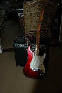
Below is a photo which I took of my fathers electric guitar. This is relevant to my digipak because the guitar relates to the Indie genre, as this is a key instrument which is played within the band. The guitar is also representative of a music band, and audiences associate the guitar with Indie music as it connotes that style of genre. Furthermore, a key aspect is that this guitar is red, which connotes love which is the theme of our music video. Therefore, the colour red will also be a recurring theme throughout my digipak.
 This is a photo I took of my brother, and the reason behind it is that I will feature him in my digipak as a member of the band, as inside the digipak will feature members of the band and information about them. However, because we didn't know our band personally we were unable to take photos of them ourselves. As a result, I am using family members and friends to impersonate the members.
 Below is a photo which I took my my friend Ben Dilks, because here is the connotation of the checked shirt, which represents popular culture alongside the term "Indie," as audiences associate the style of skinny jeans and checked shirts with this genre. As a result, this style of clothing is also used in our music video, therefore the theme of this style had to be continued through to the digipak
Monday, 25 January 2010
Magazine Advert Analysis

Although this isn't an advert for a new and upcoming band, this is an advertisement for a radio station which is therefore still relevant to my project as it is promoting the station. Here, the close up shot of the radio presenter is promoting his image, yet this is ironic because you only hear the voices of the presenters and there identity is never revealed.
However, the white typography of the title contrasts against the dark mise en scene, which makes the title of the station stand out to an audience as there flicking through pages of a magazine. Furthermore, underneath the title the details of the radio station is written below, which promotes the genre of music which is broad casted and the company of the station. This is the point and objective of magazine advertisements; to promote aspects of the music industry. Moreover, in the corner of the advert they have a website which is eye catching because of the way its presented next to the symbol of a white bird, which will catch an audiences eye and encourage them to log onto their website to learn more about them. Moreover, the mise en scene looks effective with the background of a city scape behind the man is blurred out, which connotes nightlife and excitement amongst city life.
Overall, this type of advert would stand out in a magazine as it effectively promotes the radio station and type of genre of music is played through the effective mise en scene and white typography which contrasts against the dark background of city life.
Saturday, 23 January 2010
Step by step of how I produced my digipak front cover
Below are the stages which describe how I produced my final front cover for my digipak (The final version is shown at the end) The description is written in the blue box. I am very happy with my overall final front cover, as it links in with our title "Nobody's Home" with the door signifying home, yet Tamas looks lost as he searches endlessly for our female protagonist.
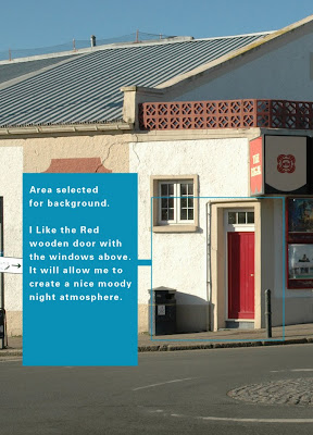 To begin with, the photo above was one which I took a few weeks back when me and my family were on holiday in Cornwall, and the building is of a cinema in a town called Wadebridge! I like the connotations of the red door, which is why I am using this image, as below you can see that I have manipulated the colours to there full potential.
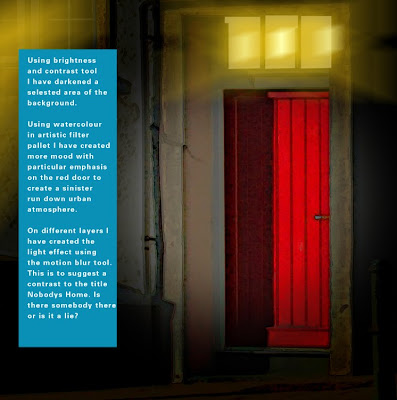 The effect which I was aiming for here is to manipulate the contrast to produce an unrealistic mise en scene in terms of the texture, which almost makes the front cover look animated. I particularly think that the lighting looks good as it is contrasted against the overall quite dark mise en scene, and produces a chiaroscuro effect.
 Now, I have added in Tamas into the background, which my original photo of him crouching, to convey his feeling of loss. This pose fits in with the mise en scene because it connotes heart break, as his hands are clutched together to show his frustration.
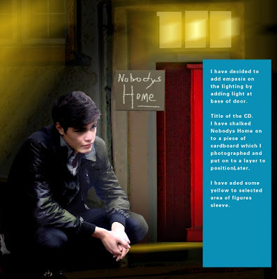 Finally, I added a photographed piece of cardboard, and chalked in the typography of the title. This gives the CD cover a quirky effect, and makes the album look slightly different amongst the others, as it emphasizes the lighting.
 Overall, I decided to have the kisses after "Nobody's Home" because it is a symbol of a love story narrative, which indicates the theme of the album. The dark and sinister mise en scene also looks effective, and produces quite a dark atmosphere which matches our male protagonists state of mind. The colour red also connotes love, which is why I had it stand out and contrast against the rest of the mise en scene.
Wednesday, 20 January 2010
Examples of possible images for my Digipak
 The image above is an example of me experimenting with different types of effects which I can use. I quite like the effect of Tamas in this, because it makes the image look more interesting. However, I wouldn't use this as a front cover, because I don' t think it is strong enough alone. However, with more manipulating I may use this for in the inside of my digipak. Therefore the image wont be wasted because the overall effect looks quite stylish.
 The significance of using a door is that it relates well to our song, because of the reference to the word "home." The idea is that our male protagonist is feeling lost and helpless, alongside being shut away in his own home from the rest of the world. Above, I manipulated a photo I took of our door, and so far simply contrasted it against a plain background which however will be changed. But I wanted to see the effect of placing Tamas inside the door which suggests to the audience that Tamas is shut of from society. This also gives our album a quirky feel.
 The image above is one of my favourites. The background is a photo I took of a painting, yet it makes a great background contrasted against the symbol of the door again. I plan to layer Tamas into this image, with the aim of using this as a perhaps my album front cover. Therefore, this will stand out strongly in a music shop such as HMV because it looks very different and unique compared a lot of other album covers, which simply have boring images of the band and nothing else to hold the audiences attention.
 Above is a possibility as a front cover, however I prefer the image with the painting and the door because it combines art work with technology. Although, again I have used the symbol of a door to signify a home. In opposition though, I think that the image of the painting will have an overall much stronger effect as a front cover for a digipak, and would have a better chance of standing out above other digipak covers in a shop. Although, the background does represent a British band as the scenery has strong connotations of a British band, as the door looks like it does belong to a small country, English cottage.
 This is just the same as the image above, apart from the typography has been added on onto the image above.
 More photos for my Digipak
The image below is a photo I have taken of a painting. The painting would fit in as a background for my album cover because it signifies a feeling of loss and confusion, which would relate to the album title "Nobody's Home." Therefore, this would be an appropriate background image for the front cover of my album. The colours are also soft and will attract an audiences eye.
 Below is an image of our neighbours front door which I took, which I will manipulate. The significance of the door is because it relates to the title "Nobody's Home," as it is suggestive of a house from the word "home" in the title. The flowers on the door can also be heavily manipulated with,in order for the pattern so stand out and contrast against the mise en scene of cover.

Finally, this was a photo I took a few weeks ago when my family and I were on holiday in Cornwall. The section of this building which I may use in my album cover is the red door, to continue the running theme of doors and "home" in my digipak. Therefore, the door may be good to use for perhaps one of the inside covers or maybe even the back; with Tamas walking through one door and out the other.

 Below is an image of our neighbours front door which I took, which I will manipulate. The significance of the door is because it relates to the title "Nobody's Home," as it is suggestive of a house from the word "home" in the title. The flowers on the door can also be heavily manipulated with,in order for the pattern so stand out and contrast against the mise en scene of cover.
Finally, this was a photo I took a few weeks ago when my family and I were on holiday in Cornwall. The section of this building which I may use in my album cover is the red door, to continue the running theme of doors and "home" in my digipak. Therefore, the door may be good to use for perhaps one of the inside covers or maybe even the back; with Tamas walking through one door and out the other.

Digital photo's I have taken for my Digipak
Below are digital photos which I have taken to use for my digipak cover. They are currently in raw form and will be manipulated in great detail in order for the photos to be suitable for the genre Indie for our band The New York Fund. Furthermore, Tamas, our male protagonist, will be on the front cover to promote our band because I and my group were unable to meet our band to take photos of them. However, using Tamas will still promote our band successfully. Moreover, each image will aim to portray Tamas looking lost, because the title of the album cover will be "Nobodys Home" - the name of our song. Therefore the image will try and capture Tamas looking lonely and in deep thought. Furthermore, each picture will be manipulated and contrasted into a suitable background, which I will take with my digital camera. I will also use special effects to make the album cover almost look unrealistic and quirky, so the front cover wont be boring but will capture a passing audience.
 The above photo is a mid shot of Tamas slouching next to the iconic Indie image of a guitar, an instrument which is if course played the most in our band The New York Fund. Tamas looks appropriate to promote our band, especially in terms of costume. For example, the check shirt and skinny jeans are a reflection of popular culture, which many teenagers of our society wear, alongside members of The New York Fund. Also, Tamas is wearing similar style of costume in our music video, meaning it is being promoted well.
 This shot is one of two of Tamas sitting on a sofa, however I doubt that I will use this photo for my digipak because the other one is better quality and allows me to manipulate the image in more ways and contrast Tamas against a suitable mise en scene.
 The aim of this pose was to make Tamas look natural and happy. This is because, in every cover of my digipak if Tamas is featured looking unhappy, then this can produce a negative image upon the band. Therefore this can result in audiences perhaps not purchasing in the album because automatically audiences will think that the band will only produce depressing songs which audiences can't relate to.
 This image is a clear mid shot of Tamas, which enables an audience to familiarise themselves with the image of our male protagonist. Then, if audiences watch the music video they will recognise Tamas on the cover. As a result, if they enjoyed the song then they will be likely to buy the album if the cover relates well to the music video.
 Despite this image looking raw so far, I personally think that a lot can be manipulated with Tamas and the way he is slouching against the sofa. For example, with the use of photoshop plenty of effects can be applied to make Tamas look as if he day dreaming about the girl he loves. (This being the female protagonist in our music video.) I also like the way his arms in stretched out over his head to make his pose look effortless.
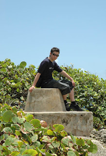
 I took a photo of Tamas looking like this because of the way he is crouching. This looks quite effective because it conveys the idea of Tamas looking out into space and lost in his own thoughts. The way Tamas is crouching down on the ground conveys an idea of Tamas in pain and lost the ability to carry on searching for our female protagonist.
 The purpose of this image was to capture Tamas close up, in order for the audience to capture a close look at his face and body language. His body language in this photo suggests that he is in pain from being separated from his girlfriend, which therefore relates to the title of our album well.
 Again this is another pose of Tamas crouching to the ground, which again signifies the theme of lost love. The way that Tamas has his hands clasped together again conveys an idea of Tamas concentrating hard, yet whilst he's also trying to keep himself together.

This final image enables the audience to capture a full length image of Tamas, which allows his costume to stand out to an audience. Tamas looks stylish here, therefore he would appeal to female fan base. Yet, whilst also appealing to males because they can relate to his style of clothing.
The above photo is a mid shot of Tamas slouching next to the iconic Indie image of a guitar, an instrument which is if course played the most in our band The New York Fund. Tamas looks appropriate to promote our band, especially in terms of costume. For example, the check shirt and skinny jeans are a reflection of popular culture, which many teenagers of our society wear, alongside members of The New York Fund. Also, Tamas is wearing similar style of costume in our music video, meaning it is being promoted well.This shot is one of two of Tamas sitting on a sofa, however I doubt that I will use this photo for my digipak because the other one is better quality and allows me to manipulate the image in more ways and contrast Tamas against a suitable mise en scene. The aim of this pose was to make Tamas look natural and happy. This is because, in every cover of my digipak if Tamas is featured looking unhappy, then this can produce a negative image upon the band. Therefore this can result in audiences perhaps not purchasing in the album because automatically audiences will think that the band will only produce depressing songs which audiences can't relate to.
  This image is a clear mid shot of Tamas, which enables an audience to familiarise themselves with the image of our male protagonist. Then, if audiences watch the music video they will recognise Tamas on the cover. As a result, if they enjoyed the song then they will be likely to buy the album if the cover relates well to the music video.
  Despite this image looking raw so far, I personally think that a lot can be manipulated with Tamas and the way he is slouching against the sofa. For example, with the use of photoshop plenty of effects can be applied to make Tamas look as if he day dreaming about the girl he loves. (This being the female protagonist in our music video.) I also like the way his arms in stretched out over his head to make his pose look effortless.
 I took a photo of Tamas looking like this because of the way he is crouching. This looks quite effective because it conveys the idea of Tamas looking out into space and lost in his own thoughts. The way Tamas is crouching down on the ground conveys an idea of Tamas in pain and lost the ability to carry on searching for our female protagonist.
 The purpose of this image was to capture Tamas close up, in order for the audience to capture a close look at his face and body language. His body language in this photo suggests that he is in pain from being separated from his girlfriend, which therefore relates to the title of our album well.
 Again this is another pose of Tamas crouching to the ground, which again signifies the theme of lost love. The way that Tamas has his hands clasped together again conveys an idea of Tamas concentrating hard, yet whilst he's also trying to keep himself together.
This final image enables the audience to capture a full length image of Tamas, which allows his costume to stand out to an audience. Tamas looks stylish here, therefore he would appeal to female fan base. Yet, whilst also appealing to males because they can relate to his style of clothing.
Tuesday, 5 January 2010
Digipak Ideas
To begin with, the main idea of a digipak is to promote the band/artist. Therefore, on the front cover of my digipak I have decided to have Tamas on the front since he is going to promote our band "The New York Fund." Also, if audiences have watched the music video, then they will recognise Tamas on the front, therefore they shall buy the album.
Many digipak covers have the band on the album, unless they happen to be really well known where featuring them on the front isn't necessary. An example of this would be "The White Album" by The Beatles. However, all new artists would have to feature on the front, in order to be the most successful it can. Inside my digipak, I have decided to feature the use of concert and tour dates, in order to increase the promotion of ticket sales. This is also a key feature which many albums have inside. Furthermore, on the back of the digipak I will have a list of all the songs which will be played on CD. As a result, this is a common feature that is often on the back of album covers. For example, Florence + the Machine album "Lungs," and the albums such as "Now 47" which has a wide range of featuring items. Furthermore, by featuring Tamas on the front cover of the album, this will help the audience recognise the artist and could potentially build up a fan base.
Ideally, I would like some sort of unusual mise en scene in the background of Tamas, to make the album cover stand out. I've also decided that perhaps the mise en scene will be gray scale, while Tamas is bright, colourful ans bold. The typograhpy of "The New York Fund" will also be bright to contrast against the gray scale, so the name of the band stands out to a passing audience. I haven't decided yet if the entire digipak will be gray scale, but it would be nice to have a continuing colour theme throughout the whole album, with the typography for tour dates inside and the name of the songs on the back to be the same colour as the name "The New York Fund." Therefore, the digipak will look co-ordinated and look good visually.
The mise en scene of what the front cover of my digipak will be is undecided, but I defiantly intend to include a quirky background in order for the digipak to stand out amongst other albums in the record shops.
Subscribe to:
Comments (Atom)