The demographic of our target audience is female’s aged 16-15 years old. The reason why is because a female audience will be able to identity with our female protagonist in our music vide as the theme is romance. Therefore, this genre will instantly attract a female fan base around the age of 16-25 years because during this period is when adolescents experience being in intimate relationships. Our “ideal” audience will have been educated at sixth form and perhaps furthered their education by attending University. Our demographic will also be from a middle class background and aspire to have good careers. Having an ideal demographic of our target audience allowed I and my group to establish appropriate generic conventions in order to strengthen audience appeal. To begin with, our band was within the Indie genre; therefore we used, developed and challenged forms and conventions of other music videos with similar genres. For example, we used a variety of shots for our mise en scene including background images that culturally represent Britain, such as the cobbled streets from Elm Hill, and using medieval typical British buildings in the background. These cultural references are similar to other British Indie bands, such as Scouting for Girls. For example, in the bands music video “Elvis Ain’t Dead,” the band uses a wide variety of outside shots of the British streets as their mise en scene throughout the music video, which also connotes a lively atmosphere of crowds of people which matches up with the up beat tempo that is associated with this Indie band. Also, we used a wide range of close up camera angle shots in order to successfully promote our band so a potential fan base can recognise the new artist. This is a key feature of Goodwin’s music video theory, where demands of the record label will include the need for lots of close ups of the artist, allowing the artist to develop motifs which recur across their work. The use of close up shots is a technique utilised with music videos such as Razorlight and U2. For example, below is a still of U2 showing how the camera is positioned close up which emphasizes the identity of each band member.
 Below is a still of the lead band member from Razorlight, and shows the importance of close up shots as from this still an audience instantly gains familiarity with the bands identity.
 We developed the use of close up shots by using match on action shots and plenty of transitions to add to the notion of nostalgia. Furthermore, another band which uses similar aspects of mise en scene with our music video is “The Scientists” by Coldplay, because again they shoot their entire music video outside with connotations with British buildings, streets and parks. The use of greenery in their music video is similar to the shots of our female and male protagonist in the park, which brings liveliness to our music video as well as giving the audience more information on the lovers. Below is a still from Coldplay’s music video “The Scientists” and the mise en scene connotes British scenery of the woods and greenery, yet the isolated location connotes the theme of loss which is also reflected in I and my groups music video.
 Moreover, we used strong colour imagery such as the vibrant red roundabout contrasted with a bright sunny day to connote nostalgia, love and happiness. The contemporary issue of commitment between two lovers is also represented in our music video, as we convey a theme of strong passion and the pleasure involved between two people yet have been torn apart from the ambiguous death of our male protagonist. Therefore in our music video fairly complex issues have been explored, as the music video explores the transitory nature of an adolescent relationship and their impact. The convention of placing the male’s voice in the forefront reflects the dominance of males in the music industry, for example all male Indie bands such as Coldplay. Our music video also references “Barthe’s Theory of Narrative” whereby a narrative is made up of several threads which overlap/meet, and there is an absolute plurality of potential meanings. Our music video mirrors this, as the narrative of a death that is left ambiguous is made of sequences where our female and male protagonist meet and overlap; achieved by a range of match on action shots. Furthermore, our music video applies to Gunther Kress’s theory of genre, whereby our audience will feel comfortable at home watching our music video because it is a generic text, and doesn’t include perhaps offensive representations such as adolescent binge drinking and “gang culture.” Instead, in order to utilise generic conventions of the romantic genre, using appropriate costume was a crucial aspect for our music video. For example, my group and I emphasized the colour red numerously throughout our music video, as red is heavily associated with love and passion. In order to do this, we dressed our female protagonist in a red coat, alongside shooting a red roundabout in our park sequences.
For my digipak cover and magazine advertisement, the illustration which I used was similar to other generic products. To begin with, the main theme of my digipak was focused around the symbol of the red door, which matched with the song title “Nobody’s Home.” The symbol of the door is used in other digipak covers which I have seen being sold in shops such as HMV. An example of one is The Kooks album “Konk” where the band is shot just outside a black door with the title of their album written in blue typography along the top of the door, which acts as the name of the building. Similar to my digipak, the rest of the mise en scene is kept simple with the background in black so as to not over complicate the front album cover. However, with mine I used the boldness of the colour red as a running theme, as the red is an important aspect associated with our music video as it matches the red coat which our female protagonist wears throughout our music video. This particular colour also connotes love, danger and passion. Moreover, with my magazine advertisement I used the generic convention of featuring a range of tour dates across the image to promote the band and release of the album which is an obvious feature that is included in every advertisement. Alongside that, I have details such as the name of the record label to promote the band as their new and upcoming. I also carried on similar themes such as the red door so their fans make a connection between the album cover and magazine advert.
How effective is the combination of your main product with ancillary texts?
Digipak:
I have used a strong combination of my main product with my ancillary texts, as I have made a link between all three. For example, in aim of utilising a particular brand style, I have combined visual aspects of our music video to my print productions. The strongest visual aspects which I have used are the strong red imagery of our female protagonist red coat, which I have transferred to my media productions by using a bright red door and the title of our band in red. The reason why this colour is an important visual image is because throughout our music video we have continually used imagery of this colour to suggest the female from the red coat, red jumper which our female protagonist wears and the red roundabout which features in many shots. In terms of my first panel which was the digipak front cover, it was important to insert stills as a reference to Goodwin’s music video theory of “recurring motifs,” so our target audience could recognise our male protagonist on the front cover which creates a band style, allowing The New York Fund to develop a fan base. I used the symbol of the door which connotes “Nobody’s Home” as it suggests our female protagonist has disappeared as our male protagonist is the only actor featured on my digipak and magazine advert. Furthermore, the typography of the title is fairly suggestive of death and lost love, as the title almost conveys an image of dripping blood which is suggestive by the twirling red letters. Also, on my first panel I continued using twirling lettering for our song title “Nobody’s Home,” which connotes a generic romance genre, alongside included kisses after the song title to exaggerate the theme. Below is my final first panel:

In terms of my second panel which featured in the inside, I decided to feature stills of instruments such as a guitar, as this was important in terms of emphasizing the Indie genre, which is a genre heavily reliant on using instruments such as an electric guitar. Also, on my second panel I had stills of our male protagonist alongside two other males which act as members of our band The New York Fund. Although the other two males never feature in our music video, it was important to include them in the digipak, as the digipak is released specifically to promote the all members of the band so they can develop a fan base and attract their target audience. Below is an image of my final second panel:

Moreover, the generic convention of using musical instruments was carried onto my third panel, whereby there is also a still of our dominant male protagonist looking lost. Therefore, this was a reference to our music video because it indicates to our target audience who buy my digipak that our male protagonist will be searching for someone as part of the narrative. Moreover, our male protagonist stands out against the dark mise en scene, which enhances our male protagonist identity which consequently means that The New York Funds growing fan base will gain familiarity with members of the band. Moreover, I manipulated the lighting so my male protagonist appeared to be crouching in the shadow, which enhances the overall effect of this panel because the lighting adds interest as the tone is differentiated. Below is the final image of my third panel:

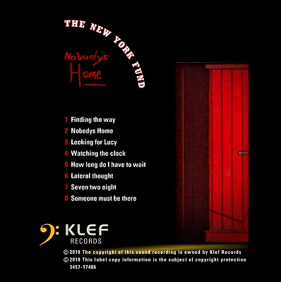
Finally, in regards to my fourth and final panel, I used the symbol of the red door again which emphasizes the song title “Nobody’s Home” again, alongside a list of each song that will be featured in the album. This was an important convention to use because numerous albums such as “Florence and The Machine” feature each song track as a method of promoting each song in hope to gain more success. The reoccurring image of the door creates a strong theme which runs continually from the music video, magazine advert and the remaining panels. This is because the door connotes the theme that “nobody is home,” which is an obvious link to the song title. Below is the final version of my fourth panel:
Magazine Advert:
I carried on the visuals of the red door and lettering to my magazine advert to utilise a reoccurring theme. However, I also made sure that my print productions still connoted the Indie genre; therefore I featured the instruments which are played in our band “The New York Fund” such as a guitar and a drum kit. As a result I have utilised a band style, so the particular typography which I have featured on my print productions will be permanently used on their future records. The magazine which my magazine advert will appear in is NME, because this magazine continually promotes new and upcoming bands, often of a similar genre. Therefore, NME magazine is appropriate because audiences who buy this magazine will hopefully fit the criteria of the demographic for our target audience. Also, on my magazine advert I used large and bold typography for the slogan “New Debut Album,” in order to convey the message across to audiences that The New York Fund is a new and upcoming band which is worth listening to. Again, stills of our male protagonist are featured on the magazine advert instead of our female protagonist because it connotes that our male protagonist is lost and alone in searching for his love. Moreover, the reason why I chose to use a still of my male protagonist with his eyes shut and arms behind his head is due to the fact it connotes tiredness from travelling round and playing on a tour. Furthermore, originally I was promoting tour dates, yet with the media brief changing I had to change this into instead promoting a debut album. Therefore, to make the mise en scene look more interesting as an overall visual I included the slogan “New British Band” as a method of not making The New York Fund appears as an American band. Therefore, the iconic British flag represents British culture. Below is a final image of my magazine advert:
 What have you learnt from your audience feedback?
To begin with, the research method our group used in order to receive feedback for our music video involved handing out numerous questionnaires (in total 18) to a demographic of 16-18 male and female participants, with the occupation of being sixth form students. All participants were also studying Media Studies at either AS or A2 level, which meant that each participant had background knowledge of what consists of making a high quality media production. However, implications of using questionnaires as a research method are the reliability of the results, since participants could quite easily have lied. However, questionnaires meant that our group could hand out as many as we needed in order to gain a big sample size, so we could have a wide range of audience feedback.
Regarding the first four questions which involved the participants having to rate on a number of factors involving the quality of our music video from 1-5, (1 being the lowest, 5 the highest) there were a range of different opinions. To begin with, with the first question being “How much did you enjoy the music video?” there was an average rating of 4, with one participant circling 5, yet around four participants circling 2. Therefore, this shows the diverse range there are in participant’s opinions, with obviously the Indie genre with a love themed music video only appealing to certain sixth form students. Also, this could perhaps be an indication of participant’s unique genre taste, as a female who could be fanatic about romantic comedies would potentially find our music video appealing, yet on the other hand a male who may only be interested in action films may not find our music video that interesting to watch. Furthermore, the same pattern of results spiralled across the next three questions, with an overall average rating regarding the first four questions being 3 out of 5. Moreover, an interesting pattern has occurred with females giving an overall higher result than males, would shows gender differences are appearing which could perhaps indicate personal taste in genre. Males on the whole circled between a range of 2-4, where-as females tended to circle around the range of 3-5. However, because our music video explores the theme of romance and relying on a non-linear narrative of flashback sequences, this may not appeal to 16-18 males as they may find it harder to relate to, where-as females being the biggest target audience for romantic films such as “Love Actually” and “Bridget Jones” may be able to relate to the female protagonist.
In terms of the 5th question regarding the music videos length, a majority of participants circled “correct length,” with only a few extraneous participants who either circled too short or too long. However, with our music video lasting the correct length that was on our brief, it seems fitting that our audience should circle correct length (2-3 minutes.) Moreover, gender differences seem to have occurred again with the 6th question “would you watch it again?” as a majority of females apart from two circled yes. On the other hand, around five males circled no, two yes and the majority undecided. Again, this proves how personal genre is and is important in terms whether or not a music video will hold an audiences attention. Furthermore, in terms of question 7 “Can you suggest anything which could improve the appeal?” there were a number of different suggestions. These involved “Clearer narrative,” “more locations,” “less cross fades,” “less romantic scenes,” “more excitement” and lastly “more depth to the story.” Therefore, in regards to these suggestions, this implies to my group and I that perhaps we should have experimented more with unique shots in more variations of settings, in order to liven the music video up and not be as repetitive. Especially the round a bout sequences which our group have realised went on for too long. Therefore, we should have replaced the last 10 seconds of round a about shots with something else more interesting and not purely focusing on the romance between our male and female protagonist. Absolutely no participants stated they found any material offensive, and in regards to question 9 “Was there any part you found confusing or hard to understand?” the only reply was that the narrative was unclear. However, in reaction to this, a music video doesn’t have to have a clear narrative in order to be successful; instead my group and I felt that a non-linear narrative was fitting for our genre since we decided on leaving the death of one of our protagonist ambiguous. Therefore we wanted to leave our audience guessing. Question number 10 “What is the best part of the production,” produced a number of answers including; “camera work,” “roundabout shots,” “editing,” “narrative” and one participant responded “I liked the close up of the red coat, striking and I liked the roundabout and how it had continuity.” As a result, this indicates that the strongest points of our music video were our editing skills and camera work, with particular strength on the editing of the roundabout sequences.
Regarding questions 12 “Does the video reflect the style of music?” every participant circled yes, which shows that we reflected our band The New York Fund in a positive light in terms of reflecting the Indie genre. Moreover, the following question “Does the video successfully promote the artist/band/group:” a majority of participants circled yes, with only a few answering no. This indicates that we should have perhaps used some performance material in order to promote our band more, as we only included close up shots of our female and male actor. In conclusion, the last question “How high would you rank the music video?” the average score was 4, with 3 being the lowest our participants ranked it. Therefore, I can conclude that my group and I successfully created a good quality music video.
In terms of audience feedback regarding my digipak and magazine advert, there were numerous responses. To begin with, in order to gain audience feedback I printed of my final versions of all four panels and magazine advert and showed them to a demographic of 10 participants aged 17-18 years old with the occupation of being sixth form students. There were altogether six males and four females. Instead of designing an evaluation sheet, I asked my demographic to write down one weakness and strength of my digipak and magazine advert. In terms of my digipak, six of participants stated that my strength was “the use of graphics,” followed by two participants commenting that it was the “use of stills,” and finally the remaining stated that my strength was “the bold colour imagery.” Therefore, this indicates that the overall product looked visually interesting and strong, especially the strong colour red which was a running theme throughout my music video. However, in terms of weaknesses, four participants stated that my third panel with my male protagonist crouching on the ground was the weakest in terms of it not being very interesting. As a result, this indicates to me that I could have worked harder on my third panel in order to make it appear more visually interesting. Three participants then stated that there could have been more of a variation over the choices of imagery used. Therefore, this suggests that the repetition of using the image of my male protagonist on three out of the four panels could have been altered to create a variation in stills. This indicates to me that I could have also taken photos of my female protagonist in order to make the panels more interesting. The remaining participants didn’t state a weakness; therefore I couldn’t gain a fair comparison of my strengths and weaknesses.
Regarding my magazine advert, in terms of strengths five participants stated that it was the use of graphics; in particular the door. Therefore, this suggests that I made a good, clear link between my digipak and magazine advert. Furthermore, my following strengths were the still shot of my male protagonist and again my colour imagery. As a result, this indicates that my best assets in designing the magazine advert was my use of graphics, and overall made a good quality magazine advert. However, in contrast the main weakness which my demographic stated was that there wasn’t enough on the magazine advert to make it visually interesting. In conclusion, this suggests to me that overall my graphics in both my digipak and magazine advert was of good quality, yet I needed to work harder in creating more of a variation between panels and on my magazine advert to keep them looking more interesting.
Furthermore, I have received more audience feedback for my print productions by distributing five questionnaires out to sixth form media students aged 16-17 of both genders. In total, four males evaluated my print productions alongside one female. To begin with, in terms of the first five questions where the participant had to rate 1-5 on certain qualities associated with my print productions, an average rating was 3 out of 5. The questions included “Does the digipak successfully reflect the genre of music?” “Does the magazine advert successfully reflect the genre of music?” “How do you rate the standard of graphics in the package?” “How do you rate the standard of graphics and print?” and finally “How successfully is the Britishness of the package established?” The question which I received the strongest marks for was “How do you rate the standard of graphics and print?” Therefore, this indicates to me that I achieved good quality print productions which look visually strong with the use of graphics, in particular the iconic red door. On the other hand, an area which I could have improved on was “Does the digipak successfully reflect the genre of music?” This is because my average rating for these questions was 2 out of 5, which suggests that I unsuccessfully reflected the Indie genre from my print productions. As a result, in order to improve this aspect I could have worked harder in including aspects that are more representative of the Indie genre, such as more instruments and perhaps live stills of the band playing their instruments.
In terms of question 6, “Would the magazine advertisement encourage you to buy the digipak?” three participants stated undecided, and two participants stated no. The two participants who stated no were also male, which indicates a possible gender difference in the respondents answers. For example, females may be more inclined to buy the album because my print productions are suggestive of a romance from my use of colour and graphics. Therefore, with females tending to enjoy the romantic genre more than males, this suggests a possible reason why males didn’t like my print productions as much. Furthermore, this also indicates that I could have worked harder on making my print productions appeal to both genders. Only one participant filled in the seventh question, which was “Can you suggest anything that could improve the appeal of the productions,” with the one male participant stating “Make it more interesting.” As a result, this indicates to me that I could have used more of a variation of graphics to make my print productions not so repetitive, and to enhance its appeal. All participants stated “no” to the 8th question “Were there any aspects that you found offensive,” therefore my print productions obviously weren’t offensive. In terms of question 10 “Identify the strongest feature of the print productions,” I received a range of answers. One participant stated “Image of the artist,” then one participant wrote “Photography and typography,” and finally the other participant stated “Album cover.” (The other two participants did not answer) Therefore, this indicates that I could have worked harder on my other three panels so they were equal quality of the album cover. Also, this also suggests that my typography of the bands name “The New York Fund,” looked visually strong. Finally, in terms of my overall rating, three participants circled three, one participant circled four and finally one participant circled five. As a result, this tells me that my print productions were fairly good in terms of promoting the artist, yet there were areas which I could have improved on, such as variation in graphics, in order to represent the Indie genre.
In terms of question 6, “Would the magazine advertisement encourage you to buy the digipak?” three participants stated undecided, and two participants stated no. The two participants who stated no were also male, which indicates a possible gender difference in the respondents answers. For example, females may be more inclined to buy the album because my print productions are suggestive of a romance from my use of colour and graphics. Therefore, with females tending to enjoy the romantic genre more than males, this suggests a possible reason why males didn’t like my print productions as much. Furthermore, this also indicates that I could have worked harder on making my print productions appeal to both genders. Only one participant filled in the seventh question, which was “Can you suggest anything that could improve the appeal of the productions,” with the one male participant stating “Make it more interesting.” As a result, this indicates to me that I could have used more of a variation of graphics to make my print productions not so repetitive, and to enhance its appeal. All participants stated “no” to the 8th question “Were there any aspects that you found offensive,” therefore my print productions obviously weren’t offensive. In terms of question 10 “Identify the strongest feature of the print productions,” I received a range of answers. One participant stated “Image of the artist,” then one participant wrote “Photography and typography,” and finally the other participant stated “Album cover.” (The other two participants did not answer) Therefore, this indicates that I could have worked harder on my other three panels so they were equal quality of the album cover. Also, this also suggests that my typography of the bands name “The New York Fund,” looked visually strong. Finally, in terms of my overall rating, three participants circled three, one participant circled four and finally one participant circled five. As a result, this tells me that my print productions were fairly good in terms of promoting the artist, yet there were areas which I could have improved on, such as variation in graphics, in order to represent the Indie genre.
How did you use media technologies in the construction and research, planning and evaluation stages?
Planning:
The blog (http://www.blogger.com/) has been a significant part of the production of my music video and print productions, as I used it to record all aspects of research and planning. To begin with, in terms of our music video I used the blog as a way to keep record of all I and my groups planning to show our journey and how we developed and strengthened narrative/costume/actor ideas. Furthermore, I used the blog to record the times which I and my group would meet to plan our music video, and eventually shoot and edit. As a result, the planning and shooting of the music video was relatively painless. The blog was also useful because it enabled me to upload photos of possible locations straight onto it, so we could sit down and looks through each shot and decide whether or not the location would be suitable to use or not. Moreover, in terms of recording planning for both my print productions, the blog was great as it enabled me to upload possible digipak covers and show my teachers so they could immediately evaluate which one was perhaps stronger. As a result, I was able to upload as many possibilities as I wanted to, and it made it easier to decide which faces were the strongest as other peers were able to assess my work simply from logging onto the website. I could also record what soft wear I used and keep track of which still images I decided to feature and manipulate for my print productions. However, the main strength of using the blog was that it was easy for my teachers to leave comments to help me improve my planning in order to achieve the highest grade possible. Furthermore, I used Sky digital music channels such as “MTV,” “Kerrang” and “Kiss” to watch other music videos to help gain ideas of what narrative my group and I could use which was appropriate for our Indie genre. As a result, television is a huge advantage in watching other artists creations as not only does this in inspire ideas for narrative, it also reminds us of important and generic camera angle shots.
Construction:
Construction:
I and my group used a Cannon Mini DV digital camera alongside a tripod to shoot our music video. The type of camera used was good as we were able to tilt the camera when necessary in order to gain more interesting shots, zoom in/out or keep a very steady shot when using a tripod. Digital cameras also allowed I and my group to review raw footage and thus make progress on the construction of our music video. Furthermore, using camera are a fast and efficient way to shoot material, therefore if we needed to shoot urgent footage then using a digital camera enabled us to do this. The tripod also enabled us to track when appropriate without making the shots too shaky and adjust the height so we could either shoot from a low angle or high angle. I and my group didn’t need any sound equipment because we weren’t including any diegetic sounds in our music video; only non-diegetic with original sound tracks. Furthermore, we only adjusted the gradient and lighting in the editing stage, by using “Premiere Pro Elements” for our editing software. The software enabled us to include many special effects to achieve a product of high standard. For example, we used a vast amount of cross fades and dip to whites in our music video, which was appropriate for our song choice as we were able to fade each close up of our male and female protagonist face in order to maintain visual interest and communicate the idea of illusion and memory. We also achieved creating fast cuts for our roundabout shots to coincide with the chorus of our song, as the fast cuts kept in time to the beat. Again this is a reference to Goodwin’s music theory of there having to be s relationship between the lyrics/music and visuals in order to attract a fan base. Another special effect which we often used was speeding up certain shots, such as the tracking shots of our female and male protagonist feet walking, and certain roundabout shots to portray strong motion and movement, as we used the symbol of both the roundabout and a moving fan on a ceiling to convey a feeling of “never ending” and “eternity.” Also, this connotes the circulatory nature of the protagonist’s search to create a narrative from his loss.
The software I used for both of my productions was Adobe Photoshop Elements, and I used a wide range of effects in order to manipulate the images taken from my stills camera onto Photoshop. The stills camera I used to take my photographs is a “Nikon D70, Digital SLR” and I was able to photograph great images of our male protagonist, the front of a building with a red door and iconic instruments. For example, on Photoshop I used effects such as watercolour in artistic filler pallet to create more mood and emphasis on the red door to create a sinister and claustrophobia urban atmosphere to indicate the Indie genre. Also, using different layers I have created the light effect using a motion blur tool, and the brightness and contrast tool I darkened selected areas of background in both my digipak and magazine advert.
Research:
Social networking sites such as Facebook and Myspace are a huge reflection of popular culture amongst adolescents. Therefore, using social networking sites enabled my group and I to gain audience feedback on our music video and my print productions. This is because social networking sites enable you to post clips from Youtube and stills, allowing your peers to leave either positive/negative feedback. Consequently, it is a quick, cheap and efficient way to gain quick audience feedback which is crucial in helping you to understand where your music video or print productions need improving. Myspace is a particularly important website which my group and I used to research into unsigned bands. This is because Myspace plays a dominant role in the music industry in promoting unsigned bands where they play their singles for free online. As a result, allowing us media students to have instant access to thousands of new talent. Not only is Myspace a good website for instant access to music, Youtube is also significantly important. Youtube allows audiences to have immediate access to either signed or unsigned artist, and this is particularly important because this is a form of promotion. By having music videos so accessible, it allows fans to watch new material by their favourite artist, consequently promoting new singles and music videos. This also continues to promote a strong brand style for each artist. Evaluation:
In order to successfully fulfil OCR requirements, the use of digital cameras allowed me to take appropriate stills so I could then process them onto my evaluation. Also, Youtube allowed embedding videos of similar Indie genre into my evaluation for comparative purposes. Therefore, this shows how important technologies are in being able to compare my group and I music video with others so we can see where we needed improving. The use of embedding also allowed me to upload appropriate music videos onto my blog for the planning stages of my music video and print productions, so I could watch these videos and identity any generic conventions which could be transferred to I and my group’s music video.


